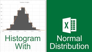
The "6" value is for 6 standard deviations, or 6 Sigma. The calculation for the x points; $c$3-3*$C$5, he was subtracting 3 standard deviations and was not just subtracting a value of 3. Cell C5 had the standard deviation (STDEV) value for the data population. He created the 100 randomized points in order to create a cleaner, symmetric bell curve that would allow for him to illustrate the 1, 2, and 3 Sigma distributions.
Hi. Thank you for the video. But I seem to have a problem. After I clicked "select data source" then "add", I can only select for the y axis and not for the x axis. Basically, there is only one slot for selecting an axis. Do you know what's wrong? Thanks!
Try using the Y values for the ‘Series Name’ and the X values for the ‘Series Value’. It worked for me that way. You might need to cut the values so that the lines may fit on the histogram graph. There’s a ‘smoothed line’ option if the line looks jagged. Hope this helps!


I WISH I could give you more than just 1 upvote! This is PERFECTLY DONE! SUBSCRIBED!!!
Thanks for joining us
Thank you so much for this. Wish you the best!
Thanks. Hope it helps
Your series are really helpful, thank you so much!
Thanks for joining us.
Thank you for your consideration, and I hope to see you inside the membership program soon!ua-cam.com/channels/YQMvu3YszW1dgKi97Fmzow.htmljoin
¡Muchas gracias!. Por fin encontre un video tutorial que me sirvio.
Great work, thank you for sharing.
Thank you for your consideration, and I hope to see you inside the membership program soon!ua-cam.com/channels/YQMvu3YszW1dgKi97Fmzow.htmljoin
Thank you so much for this tutorial. It helped a lot!
Thank you for your consideration, and I hope to see you inside the membership program soon!ua-cam.com/channels/YQMvu3YszW1dgKi97Fmzow.htmljoin
I don't understand what you did @ 7:11 of the video. And what's the formula you have created for X. Can you explain?
Superb... thanks brother ❤
Thanks
SO GOOD. Thank you so much.
Thank you so much for this tutorial! Its was really helpful
Thanks
Thanx dude. That was helpful.
Thanks
A lot of good thing. Thanks so much!
Great 👍
Good job man, thanks a lot!
thanks
why did you divide 6*std dev by 100 for the increment? And why did you first subtract (3*stdev) from mean and then took the (point * 6-stddev)?
so good. thanks
where can i download the template
Thanks
Very good, ....Thanks for share this video
Thanks
for the inc formula, what's the 6 stands for? and for the formula you used to calculate X, $c$3-3, why minus 3?
The "6" value is for 6 standard deviations, or 6 Sigma. The calculation for the x points; $c$3-3*$C$5, he was subtracting 3 standard deviations and was not just subtracting a value of 3. Cell C5 had the standard deviation (STDEV) value for the data population. He created the 100 randomized points in order to create a cleaner, symmetric bell curve that would allow for him to illustrate the 1, 2, and 3 Sigma distributions.
Hi. Thank you for the video. But I seem to have a problem. After I clicked "select data source" then "add", I can only select for the y axis and not for the x axis. Basically, there is only one slot for selecting an axis. Do you know what's wrong? Thanks!
Try using the Y values for the ‘Series Name’ and the X values for the ‘Series Value’. It worked for me that way. You might need to cut the values so that the lines may fit on the histogram graph. There’s a ‘smoothed line’ option if the line looks jagged. Hope this helps!
I'm looking to get the percentage of the histogram outside of the curve, is that possible? If so, how can I do it?
Couldn't hear you very well