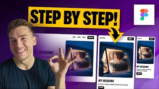
Master Responsive Design: Auto Layout & Constraints in Part 2 | Max & Min Width Explaination
Вставка
- Опубліковано 7 жов 2024
- Ready to take your responsive design skills to the next level? In Part 1, we conquered Auto Layout and Constraints. Now, let's refine our craft!
Part 2 dives into the world of maximum and minimum width restrictions. You'll learn how to use these tools with Auto Layout to create truly responsive layouts that adapt perfectly across all screen sizes.
Get ready to:
Fine-Tune Responsiveness: Master using max and min width constraints to ensure your responsive card looks amazing on any device.
Advanced Constraint Techniques: Explore advanced constraint strategies to achieve even more precise control over your design.
By the end of this video, you'll be able to create responsive cards that not only adapt but also maintain optimal size and readability across all platforms.
Learn Auto-layout in depth from Ansh Mehra - • How to use Figma Frame...
#figma #responsivewebsite #autolayout #constraints #uiux #tutorial #prototype #uiux


