it's actual meaning is Korean alphabet of ㅍㅊ represents 평창(PyeongChang) it actually looks like a museum to me too. After I watched capital letters, I found the actual meanings.
the capital letters in PyeongChang also represents syllable of Korean letters. So Koreans will find this logo's meaning so fast cuz it's made out of Korean alphabet called ㅍㅊ represents 평창(PyeongChang). This city is named white heaven meets earth. Simple logo but a beautiful logo.I am South Korean, and Fast cultures of Korea...(빨리빨리 문화)makes me disappointing too...


This has more heart than the 2022 winter olympics emblem
Saving for PyeongChang Winter Olympic 2018......
how pity you guys ...
if you know korean well, you could think this emblem is so nice
but you don't even understand it . it has dual mean.
every symbol has it's meaning. Korean and Hanza(basis of Chinease,Japanease and Meaning leader of Korean) defination
I think that this emblem is very good ^^
PYEONGCHANGPYEONGCHANGPYEONGCHANG
SOOHORANGSOOHORANGSOOHORANG
BANDABIBANDABIBANDABI
201820182018
KOREAKOREAKOREA
** the Paralympic emblem of PyeongChang 2018
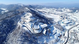
Three years later, PyeongChang.
Second Seoul olympic this year.. I guess...
ㅍ* The Olympic Emblem of PyeongChang 2018
The thing on the left side of the Pyeongchang 2018 logo looks a bit like an Asian style house.
yes. but it actually means Korean alphabet of ㅍ. which means first syllable of PyeongChang.
ㅍ*
ㅍㅊ
PARALYMPIC ** PARALYMPIC
OLYMPIC ㅍ* OLYMPIC
ㅍ*
GANGNEUNG 2018
big hangul
The graphic designs were really bold and nice, yet the animations were horrific. Almost ruined the whole video omg
Well I think the logo looks like a museum at night with a star how cute
it's actual meaning is Korean alphabet of ㅍㅊ represents 평창(PyeongChang) it actually looks like a museum to me too. After I watched capital letters, I found the actual meanings.
I'm sorry but the logo is bad, it doesn't have any personality, do you guys have designers in Korea?
That's exactly what I was thinking! MSPaint and 5 minutes and this is what you get.
And i was expecting Tokyo 2020 logo to be a little better but no....
Robinson B. Marroquin it's based on the hangul alphabet for the P and CH characters
the capital letters in PyeongChang also represents syllable of Korean letters. So Koreans will find this logo's meaning so fast cuz it's made out of Korean alphabet called ㅍㅊ represents 평창(PyeongChang). This city is named white heaven meets earth. Simple logo but a beautiful logo.I am South Korean, and Fast cultures of Korea...(빨리빨리 문화)makes me disappointing too...
shut up the logo is good!
It takes a long time to find beauties. I like but too minimalized.
这是多无聊的冬奥会啊,没有俄罗斯队,没有中国队,也没有美国队!那么去的人是去看什么呢?是去听音乐吗?
The emblem disappoint me.