Create your own KPI SPARKLINE using DEFAULT VISUALS in Power BI // Beginners Guide to Power BI

Вставка
- Опубліковано 1 лип 2024
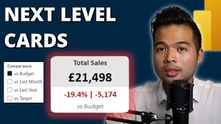
- In this video we're going to look at how you can create a KPI sparkline card in Power BI which shows you your current totals, trends, highest and lowest, and variance. All without using custom visuals
🕓 TIMESTAMPS
0:00 - Intro
02:04 - Demo
05:35 - Creating DAX measures
11:28 - Formatting the visuals
-
📣 Get Demo Files HERE
bit.ly/3dJE2O7
🔍 Looking to get started in data? Check out this COURSE to get the essential skills you need. No experience required.
solutionsabroad.thinkific.com/
📰 Sign up to our FREE Weekly Newsletter for Power BI news, community updates and more
solutionsabroad.co.uk/newsletter
🛒 Power BI TEMPLATES and more at our digital shop
solutionsabroad.co.uk/store
ko-fi.com/solutionsabroad/shop
❤ Other ways to SUPPORT us
/ solutionsabroad
ko-fi.com/solutionsabroad
📧 GET IN TOUCH
Website: solutionsabroad.co.uk/
Email: fernan@solutionsabroad.co.uk
LinkedIn: / solutionsabroad
Facebook: / solutionsabroad
Instagram: / solutions_abroad
🤝 SOLUTIONS ABROAD
Hi Power BI fans, my name is Fernan. In 2018 I founded Solutions Abroad to help fellow data enthusiasts learn Microsoft’s tool, Power BI. I’m currently based in London with over 8 years of experience working with data and business intelligence. In this channel I provide educational videos about Power BI including tips and tricks, step by step tutorials, news, and all of it for FREE. I also provide some paid content such as courses, templates as well as consultancy services.
If you like what we’re doing here and would like to support, consider purchasing something or donating through our Patreon, every little penny helps us keep the channel going.
🙏 THANK YOU
Thank you so much for checking out my channel and my videos. You, the community, have been instrumental in growing the channel to where it is now. Hope to see you again on my next video!
#PowerBI #DataAnalytics #BusinessIntelligence


Thanks for this Gold!
5:44 Titlle
8:24 subtitle measure
9:17 high and lowest
13:11 adding subtitle
13:44 Window key + . for symbols
14:34 change color based on calculation
thats a hell of a tutorial, so much worth information compacted in a assetive video. Instant subbed. Thanks for the video man!!
Thanks FERNAN for this tutorial very instructive and simple explanations ❤
Wow, you are so amazing ! Thanks for the tutorials 😊
Insane video, thank you so much.
Greate and clear! Tnx
That is cool. Thanks for the post.
🔥🔥🔥 Thank You!
Cooool! Thanks 😊
that's a cool trick sir!
Thank you farhan
Can you create a video on how to create a Fiscal Year Calendar Table lets say from OrderDate column from Fact Table and the other required columns..I already have a calendar table
when I try to add the title and subtitle it won't let me. It just remains blank after selection with a red box around it, Any ideas?
same here. Have you found a solution? Thanks
change the title measure data type onto Text
I can't believe they still haven't added the ability to use a function to change the markers. Love the hack but come on PMs let's get this corrected!
You forgot the Trend line 😅
Hello, Can i get help on this Thanks ? Switch is only reading first line. If I change the order of the line and ,[Total Sales]=_highest,"green" then it will change to green so basically showing only one colour. Here is the code
Highlights = VAR _table= SUMMARIZE(
ALLSELECTED('Order Details')
, Orders[OrderDate].[Month], "Sales", [Total Sales]
)
VAR _highest= MAXX(_table,[Total Sales])
VAR _lowest = MINX(_table,[Total Sales])
RETURN
SWITCH(
TRUE()
,[Total Sales]=_lowest,"red"
,[Total Sales]=_highest,"green"
, "#FFFFFF00k"
)
did you solve it