I hope you liked the video. If you are already here in the comment section, I invite you to let me know what other videos would you like to see in the future. Also, share any other feedback that you have on this video! I don't run ads on tutorials - the only value I get is your engagement in the MDB community. So if you would like to show your support: - Encourage more people to Keep Coding ---> Send this video to one person - Stay tuned for new content ---> Subscribe & ring the bell In the description, you will find links to some useful, free resources: 📥 Download Material Design for Bootstrap - FREE open-source UI KIT 🎓 Learn responsive web design with the latest Bootstrap 5 (full 1.5H course) 🎁 Join our mailing list & receive exclusive perks (free stuff that is normally behind a paywall) ⭐Support the creation of open-source packages with a STAR on GitHub 👪 If you have any questions - don't hesitate to ask on our Facebook group Thank you for your support!
Great video and lesson. It does not start with the details of Bootstrap as does many videos. Instead, David's video shows the effects of using Bootstrap on layouts. The orientation of the video is on the overall page and how Bootstrap controls page layout, especially for responsive design. This is a great way to teach Bootstrap. I have been struggling organizing my pages, and started looking at several other Bootstrap videos. These were not motivating as they did not tell me how to put together HTML code for a responsive design. David at MDB shows an example of how to build a Bootstrap page for responsiveness, and his video is very motivating to continue to earn Bootstrap.
1)which grid system is better and easier bootstrap or css:grid? 2) can we use bootstrap only for the grid system and the rest of the website styling to be done by vanila css?
1) Bootstrap is easier, but CSS has some easier modern features like grid-template-areas, auto-placement, and fractional units. 2) Yes, you can absolutely use Bootstrap solely for its grid system and handle the rest of the styling with vanilla CSS. This approach allows you to take advantage of the simplicity and responsiveness of Bootstrap's grid while maintaining complete control over the design and styling with your custom CSS. Here’s how you can do it: Include Bootstrap CSS: Add the Bootstrap CSS file to your project, either by linking to the CDN or downloading it. Use Bootstrap Grid Classes: Utilize Bootstrap’s grid classes in your HTML to define the layout. Custom Styling with Vanilla CSS: Create a separate CSS file for your custom styles and include it after Bootstrap’s CSS. This way, your styles can override any Bootstrap styles if necessary. Write Your CSS: In your custom CSS file, you can write any styles you need for your project. Keep Coding :)
Hello David, Great video. Have a suggestion for your next video, a bootstrap grid with; Title 1 with 4 box for images, title 2 with 3 box, title 3 with 2 box, title 4 with 1 box( each one displayed in vertical) and in small devices it displays in vertical beggining with Title 1.
i used col-md for a webpage and did css on a 1920*1080 monitor but things get broken when screen size is less 1200px... is that normal? shouldn't it stay same in 768-1200px?
Dear Ahmed, obviously we cannot cover all possible examples, please check this tutorial for more advanced setups mdbootstrap.com/docs/standard/layout/grid/
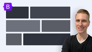
I have clicked on the video because I hoped that in the end I will know how to create the layout in cover image. It does not get even close. There wsas the example with vertical fill, but it is not in the video. Sorry, but this was not helpful.
Now that there is a powerful and easy NATIVE grid system in CSS it's really totally unnecessary to use a rather limited layer on top of that. You are missing a lot of the functionality that makes CSS grid great, like named grid areas, overlapping cells and all that stuff. There is a lot more possible with the native tools that can be replicated with some utility classes. And you will never learn how to use e.g. CSS variables to write reusable and easy to adapt But the biggest unavoidable problem with all these extra systems (and tailwind et al.) is that they will be obsolete eventually, because everyone is using this other [hot new thing]™ now, that you then have to learn. I got burned a number of times and decided to ditch all these css libraries and grid systems in favor of the native grid. And it's really great! I use only my own CSS, no third party stuff that brings it's own quirks to work around.


I hope you liked the video. If you are already here in the comment section, I invite you to let me know what other videos would you like to see in the future. Also, share any other feedback that you have on this video!
I don't run ads on tutorials - the only value I get is your engagement in the MDB community.
So if you would like to show your support:
- Encourage more people to Keep Coding ---> Send this video to one person
- Stay tuned for new content ---> Subscribe & ring the bell
In the description, you will find links to some useful, free resources:
📥 Download Material Design for Bootstrap - FREE open-source UI KIT
🎓 Learn responsive web design with the latest Bootstrap 5 (full 1.5H course)
🎁 Join our mailing list & receive exclusive perks (free stuff that is normally behind a paywall)
⭐Support the creation of open-source packages with a STAR on GitHub
👪 If you have any questions - don't hesitate to ask on our Facebook group
Thank you for your support!
How we can increase or decrease height of row or column ?
Is that any class available for that ?
0:48 Installation
4:08 Bootstrap Grid Explained
5:40 Breakpoints
6:30 Bootstrap grid examples
10:10 Changes in Bootstrap 5
10:30 Tutorial
10:55 Containers
13:49 Columns
14:14 Gutters
@Deshawn Salvador yeah it totally worked, FBI is outside my apartment now
Are you the guy of that channel?
If yes, thank you for so generous sharing... 👍
@@berjaoui92 yes I am, appreciate :) Thank you
salamat sa imong gihimo nga bedyo sege pa himo kapa ng mga bedyo
This is one of the key functions of bootstrap and its very well explained
Thank you for this. I’m a new coder and still learning Bootstrap. Your visual demonstration is easy to understand. This is what I am looking for.
Great to hear!
Great video and lesson. It does not start with the details of Bootstrap as does many videos. Instead, David's video shows the effects of using Bootstrap on layouts. The orientation of the video is on the overall page and how Bootstrap controls page layout, especially for responsive design. This is a great way to teach Bootstrap. I have been struggling organizing my pages, and started looking at several other Bootstrap videos. These were not motivating as they did not tell me how to put together HTML code for a responsive design. David at MDB shows an example of how to build a Bootstrap page for responsiveness, and his video is very motivating to continue to earn Bootstrap.
Thank you James, I really appreciate that, I am glad that you enjoyed it. :)
Those shortcuts were life changing. Love your content!
Great video! I have been having troubling understand the grid system but it's all cleared up now. Thank you!
Glad it helped!
Best explanation so far
Big thanks brother, I learned it at very ease!
That's great to hear! Keep Coding :)
Thank you! This is an enlightenment for a beginner just like me.
how do i do that shortcut @ 12:21 exactly?
Your website is amazing I used everyday
can you tutorial the desktop layout in this video please
yes, you are hero. continue same style: from scratch step by step ;-)
12 unit means 12 fractions or 12fr as in css3
thank you very much your video helped me to complete my task...expecting more video's from you....
Happy to help! We'll have some new content coming shortly (busy time for David right now, he just came back from vacation)
how do you have gaps/spacing in between the columns??
please tell me. Which bootstrap class is used to apply such spacing in between the columns
Please post question on our facebook group : facebook.com/groups/682245759188413
Very good explanation in a practical way guy. Keep adding more videos like this. I'm very interested.🖤🖤🖤
You are very clear. Very good tutorial. Thanks.
i really love how you keep your tutorial simple..
Thank you! 😊
Hi,
Thanks for the clear explaination of using bootstrap 5 and the gutter part
thank you, sir. You are life saver.
Happy to help :)
1)which grid system is better and easier bootstrap or css:grid? 2) can we use bootstrap only for the grid system and the rest of the website styling to be done by vanila css?
1) Bootstrap is easier, but CSS has some easier modern features like grid-template-areas, auto-placement, and fractional units.
2) Yes, you can absolutely use Bootstrap solely for its grid system and handle the rest of the styling with vanilla CSS. This approach allows you to take advantage of the simplicity and responsiveness of Bootstrap's grid while maintaining complete control over the design and styling with your custom CSS. Here’s how you can do it:
Include Bootstrap CSS: Add the Bootstrap CSS file to your project, either by linking to the CDN or downloading it.
Use Bootstrap Grid Classes: Utilize Bootstrap’s grid classes in your HTML to define the layout.
Custom Styling with Vanilla CSS: Create a separate CSS file for your custom styles and include it after Bootstrap’s CSS. This way, your styles can override any Bootstrap styles if necessary.
Write Your CSS: In your custom CSS file, you can write any styles you need for your project.
Keep Coding :)
@@Mdbootstrap thanks for the response🙏
@@alirezar7920 No problem, happy to help :)
Thanks for the video.
really great help! thanks!
Keep Coding :)
what extensions do you use, seems really functional
how do you have gaps/spacing in between the columns??
Please post question on our facebook group : facebook.com/groups/682245759188413
is it a full tutorial on grid systems
or it's just a beginning
like, Is there is a more advanced video on grid systems?
Great and short tutorial, thanks!
Thanks for quick introduction
thank you sir very much for the video
what is that popper link?
Have you made the second tutorial you mentioned?
Yup, just check our channels videos : ua-cam.com/users/mdbootstrap
How you giving space between column please tell me ....
Please post question on our facebook group : facebook.com/groups/682245759188413
make border man
Saved my life, thanks!
Amazing video, Thank you so much and keep it up
Glad you liked it!
what is the main difference between bootstrap4 and 5.please give an example
Main difference is jQuery. Bootstrap 4 relays on that, while Bootstrap 5 is rewritten in pure JS. You can still use jQuery with B5, though...
Thank you! Great content and diction to explain, i've learned a lot! Greetings from Brazil! Have a great week
Glad you enjoyed it!
in 13:50 you mentioned another tutorial
Is it out yet? :(
you really saved my life, thanks
Yup ua-cam.com/video/KVyEH1pIZkA/v-deo.html
Sorry but I have the same question. Your link goes to a git tutorial. Did you upload the wrong link?
how you update automatic your browser ? what is the name of the pluging for vs code?
ua-cam.com/video/fh97jo6Xur8/v-deo.html
amazing explanation in simple words. thank you sir !
Most welcome!
How to make some columns big and some columns small?
You must use the appropriate grid classes. More on this topic can be found in the documentation -mdbootstrap.com/docs/standard/layout/grid/
Hello David,
Great video.
Have a suggestion for your next video, a bootstrap grid with; Title 1 with 4 box for images, title 2 with 3 box, title 3 with 2 box, title 4 with 1 box( each one displayed in vertical) and in small devices it displays in vertical beggining with Title 1.
ty perfect toturial i love it 😘👏😘
Thanks Dawud
Nicely explained. Thank you.
Glad you liked it :)
really Useful
i used col-md for a webpage and did css on a 1920*1080 monitor but things get broken when screen size is less 1200px... is that normal? shouldn't it stay same in 768-1200px?
Thanks you.. I am learning bootstrap so it's great help to me
Glad to hear that :)
would've been cool if you provided a source of your grid example
Right?! Like the style section which just magically popped up.
Thank you
5 columns how to do
Depending on size, you could use 5x col-2 and center it using flex box (. d-flex .justify-content-center)
can u make container like amazon i am trying but failed i will not give up f u help me ?
Extra small
=768px Medium>=992px Large>=1200px
Class prefix .col-xs- .col-sm- .col-md- .col-lg-
Thanks bro! you helped me!
Glad I could help!
Videos like this make me question why I have 30+ udemy courses on Web Development 🤣.
where is the toutrial i cant see it. you explain what ???
someone has a tutorial how to make something like example 2? To make one big item that overlaps the other rows?
Awesome!!! and Thanks thanks thanks
what font (font size) and theme is used in vs code?
Check this out: ua-cam.com/video/fh97jo6Xur8/v-deo.html&ab_channel=MDB-justcodeit
useful :* thanks
really thank you brother..
You are most welcome :)
thank you for vedio.
best ❤
Happy to hear that! Thank You!
Keep Coding :)
Why the thumbnail doesn't match with the content??
Dear Ahmed, obviously we cannot cover all possible examples, please check this tutorial for more advanced setups mdbootstrap.com/docs/standard/layout/grid/
exactly! this is bad way.
Thanks
Happy to help.
Keep Coding :)
@8:30 I thought the “col-xs-12” means extra small columns, wil show 12 columns maximum. 😂😂 That makes more sense.
i need 5 columns in bootstrap how to do please help me
Use 5x col-2 and center it, it doesn't have to sum up to 12, it only cannot exceed 12 in total.
super good
Thank you! Cheers!
thanks!!
Nice
Please HELP HELP HELP
How to import new colors and how to use THEM PLEASE
Which colors do you mean? Theming? getbootstrap.com/docs/5.0/customize/color/#theme-colors
@@Mdbootstrap yea how to import them i really dont know
I got bootstrap starting
thanks!
finally, my problem is solved
I'm glad you found this video useful :)
Helpful
Glad you think so!
We are excepting examples
My like is 1000
This version just for testing
God bless you
I have clicked on the video because I hoped that in the end I will know how to create the layout in cover image. It does not get even close. There wsas the example with vertical fill, but it is not in the video. Sorry, but this was not helpful.
why can we only raise one thumb up??? 😂
🤷
Now that there is a powerful and easy NATIVE grid system in CSS it's really totally unnecessary to use a rather limited layer on top of that. You are missing a lot of the functionality that makes CSS grid great, like named grid areas, overlapping cells and all that stuff. There is a lot more possible with the native tools that can be replicated with some utility classes. And you will never learn how to use e.g. CSS variables to write reusable and easy to adapt
But the biggest unavoidable problem with all these extra systems (and tailwind et al.) is that they will be obsolete eventually, because everyone is using this other [hot new thing]™ now, that you then have to learn. I got burned a number of times and decided to ditch all these css libraries and grid systems in favor of the native grid. And it's really great! I use only my own CSS, no third party stuff that brings it's own quirks to work around.
rahmat kotta
Cliquei achando q tava em portuga. Cara de brasileiro da porra kkk
I saw the video still dont know how to create example 2, thumbs down.
This is an essence, check our other videos which are longer and explains more details.
it's not professional 😕
Hii
Bro
You are very clear. Very good tutorial. Thanks.