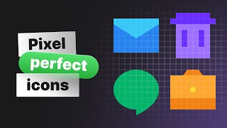
e001: Pixel Precise Icons
Вставка
- Опубліковано 2 сер 2015
- An important aspect of icon design is pixel precision. It's a fundamental concept that needs to be understood.
Every screen uses pixels, and your icons should align with them in order to be of the highest quality. I dive into why this subject is so important, what you can do right now to improve the quality of your icons, and how you can continue to master pixel precision moving forward.
Subscribe - itskyl.es/c8Td
View the written version - kyleadams.me/e001/


![ЛЕБЕДЕВ у ДУДЯ: муху не обманешь 😁 [Пародия]](http://i.ytimg.com/vi/E74h5fvVrqs/mqdefault.jpg)

I've been waiting so long for you to start making videos! Glad your starting this and good luck!
LHDesigns Thank you! I'm excited to start sharing. :)
Fantastic! Nice zooming on the tutorial. Made it easy to follow.
Awesome video Kyle, thank you, I was always wondering how to get that sharp look on icons. I will also add that working on layers in the pixel view and bringing to the front elements that you want to look sharper will help, for example a white line.
Wowww I've always wondered why my recolored icons looks different from Icon Finder. This will definitely up my design game! :)
Awesome! If you're struggling with anything else let me know. :)
Curious about your approach on hollow icon. It'll be great to see how you use stroke, combining the stroke weight, and aligning the stroke. Thank you. Keep up the good work, Sir.
Very helpful. Thank you
Thank you for watching!
Your Explanation is amazing . Keep going
I think if you can to create a series of videos that learn new and beginner person like me creating iOS apps it will be a great idea
Thanks for your videos
Kyle, that was great. I learned quite a bit that I can use, even outside of icon design! Really looking forward to more :)
I'd personally like to learn about how to make icons that actually look like the thing I'm going for. I'm not great at drawing, so if I were to try and make, say, that toolbox icon you showed, I wouldn't' know how to go about making sure it actually looks like a toolbox! Do you just rely on your artistic skill, or do you have a process you follow?
Nice video!
Keep up the good work! :D
Thanks Kyle, I really like your video.
Thanks for watching!
Kyle Adams Lynda.com is saturated, if you can - always step by step - show how design icons in Illustrator, I think your video are even better.
Thank you for this video! May i ask you a question? I use all settings to my document, but now i can not draw a perfect ellipse. I mean in pixel preview it draw only dark black pixels, without smooth grey pixels and it looks horrible. Can you help me with this problem, please? What i did wrong? Maybe i can sent you print screen?
Thanks Kyle! Would of loved to see how you could of corrected the toolbox example to pixel perfect design.
Great point, I might revisit this topic later. Thanks for watching!
how to make original icons from artwork for sketch, thank you !!!