Actual Vs Planned Gantt Chart In One View - Project Management In Excel

Вставка
- Опубліковано 16 лип 2024
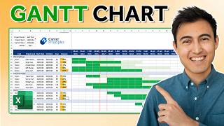
- We set up an actual vs expected Gantt chart in Excel. This will be useful for project planning purposes as it’ll show whether your project tasks are currently on track or not. A Gantt chart is a bar chart which is used to illustrate tasks to be completed over time in a project. To create our actual vs planned chart, we will add a series for the start planned dates and format this as a scatter chart.
How To Create A Gantt Chart With A Progress Bar To Show Percentage Completion Of Tasks In Excel:
• How To Create A Gantt ...
Subscribe for weekly Excel tutorials, techniques and examples:
/ @theexcelhub
Please share this video with others that may find it useful:
• Actual Vs Planned Gant...
Please comment below if you have any feedback or any suggestions for videos you would like us to upload next!
🌍 The Excel Hub website: theexcelhub.com/
📸 Instagram: / theexcelhub
ABOUT US:
The Excel Hub seeks to enhance your Excel and VBA knowledge by providing value-adding tutorials, techniques and examples in order to help you take your spreadsheet and data analysis skills to the next level.
For any enquiries, please contact:
theexcelhub@outlook.com
Overview: (0:00)
Set Up Axis: (0:52)
Add Planned Bars: (1:41)
Formatting The Actuals: (5:02)
Potential Questions: (5:53)


This was great, very creative. Makes me appreciate MS Project that much more, though haha
Clear explanation.. can we create an additional error bar to compare another set of dates
thanks a lot, great as your other videos. I am reinventing the wheel by making an MS project schedule in Excel!!!
The question, my Gantt chart for actual and planned values (error bars) is not aligned. How can I vertically align stacked and scatter error bars?
Great videos!! When I tried to add the scatter chart with the start dates and axis labels, I don't get any dots on the chart ("Excel has returned these dots...").
I see the axis labels, but no dots.
Any suggestions?
this is a powerful tool thank you... If you may, requesting i will be using the same approach to create a schedule timeline... Like i will place the break lunch and other offline activities on the same row per employee... like if i have 10 employee with different shifts and they have different lunch breaks others schedule both actual and planned... is this doable?
It is simple and easy to understand. To me it is still the best👍
Brother, You could do the same tutorial but with the Google spreadsheet (Sheets).
Greetings from CDMX.
Hi, i try to add additional task (row). does it mean I need to redo the error bar?
Is this completed Excel available for download? Would love to use for my project
After providing all of this great info, my boss was inquiring how to color code the Task labels 😪 ideas?
TELL him to buy Microsoft Project~
Is a template available for download? Thanks!
my planned error bars are way off in alingment. the first bar starts at the third or fourth row of the chart
Same 😞
Same for me.