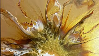
I love the depth and the contrast between the organic and the straight strikt white border. It looks lie someting is climbing out of a restricted area, like an alien out of a cage. It also makes me think of genisis. How everything started out of a mixture of gasses and oozing slime. It makes me feel strange, happy and sad at the same time, as all great art does. I am agnostic and nothing makes me feel closer to a God than beautiful art and music. Thank you!
Thank You For a Very comprehensive Info vid & itemizing the segments for future referencings, for those l8tr wanting to re-learn certain parts. Beautifull begining, mid & End Result!!! :)
Hello dear friend. Congratulations on the wonderful video you shared with us. Very interesting. Thanks for sharing, please keep in touch please. 💖 💗.💖.💖 ,.💗 💖..
Wow! This is amazing and beautiful. I like orientation 1 the best. It kinda looks like the paint is ( don't laugh) coming to life and wanting to get out and play. Bursting out of the canvas. I would title this " breaking free". I don't usually go Freud (or if I do i keep it to myself 🤣 ) but this piece makes me think and i love when art does that. Well done!
Very good I enjoyed this composition and your attention to detail and the mixtures of colors application . As your tool application with your dryer as tool did it's beautiful effects to mix colors for brilliant appearance. And your square opaque contrast WHITE also help with demential look.. I like the broken frame upright presentation position Best for wall display. Great job !! Awesome artwork. Thank you for sharing your creation.
I loved all the shades of greenand the great effects youdo so beautifully. I am not so clever with greens i always endvup with something that looks like an ad to join the army 🤣🤣
@@FluidExpressions I was not aware of masking fluid. I also didn’t know about “activating” the painters tape by painting the edges with varnish. Your videos challenged me to try new things. 😊
Very beautiful painting I enjoyed the entire video you're very informative about what you're doing and why and I found that super helpful.... thank you
interesting! I like any way it's hung except 4.... oddly I thought it'd like it best but after seeing it, I decided there's to much white on that edge to be the bottom. the border really created interest, love the greens on the black!
OMGosh! …. This piece is so different. The colours of green are unexpected and the hue shift to gold is crazy satisfying. I think the frame makes the picture! It’s ALL hugely interesting. . LOVE #3 the best. • (I just had to sub too! 😊)
I confess I spread through some but I may go back and watch it again LOL I really like this technique and your outcome is amazing! New subscriber I like number two best
I'm a trooper 💪 lol THIS IS A FRIKIN AWESOME PAINTING!! 😱 I SOOO LOVE IT SOOO MUCH!!!👀 it's absolutely stunning!! WOW! I love it in all 4 orientation ☺️ but if I HAVE to choose, I'm gonna go w #2! But #1 is second? I think? Lol idk this is battle in my head and it's not even my painting! 😆 I'm sticking w 2! Yupp 2! 👌Much luv gurl! *Pour Big & Love Hard! 💕✌️💫 P.S. oh! And There is no "proper" way to hold a hair dryer if you ask me. I heard someone say that too and it just made me, ugh idk🙄. But you do YOU. I hold mine like you do as well.. it's art! There's no right or wrong way! 🤷🏻♀️❤️
Shading around the bits that cover the white would make it more cohesive and more 3D. If it looks like a shadow is underneath it would make it pop out. It’s really pretty and a good idea, but I think a bit of shading would make a huge difference imo.
Hi I like this piece of art. I think it came out well. My only suggestion would be maybe do the framing section not in white but in a transparent colour ( maybe one you've used in the background) mixed with some gloss varnish? Just a suggestion for another time. Loved the colours of your background ❤️
That turned out AMAZING… there isn’t a wrong way to hang it actually I think 1 or. 2 are my Favs tho Kudus to you for the patience to calmly do all the necessary steps to create the magic 💚💚💚💚
I really like it but I think I'm more complimentary color instead of Stark White Would Have Made It really incredible I'm learning art so I'm not a Critic it's a beautiful piece I was just thinking a color that complimented your other colors would been better than white.
Do you have something wrong with your mick or do you mumble ... I don't know be I can't understand what you are saying. I love it, I think that was a great idea.
Can appreciate you speeding up taking off the masking fluid but it would be nice to see you go slower for at least part of it. And you are using a brush during the process? Why and how. Forgive please if you explain this later I'm just a little overwhelmed at the moment.
I used a brush during the process of removing the masking fluid to fix/fill in some spots that had been masked off but then didn't look quite right once the masking fluid had been removed. I'm also using tweezers during this process to help lift the masking fluid to be peeled off in certain spots where it was more thinly applied and kind of tricky to get a hold of. If I had just used my fingers, then my fingers probably would've ended up smudging some of the still wet paint onto the wrong places while trying to lift up/peel off the masking fluid. Tweezers were much more precise.
Meh. I really liked the original piece but the end result with the stark white looks like you tried peeling tape off and gave up halfway through. Maybe a black border or maybe no border at all. It’s all subjective where art is concerned so in the scheme of things my opinion doesn’t mean anything. In the interest of meaning nothing I’d pick #2. The bottom right having the largest “spill over” works best.


I love the depth and the contrast between the organic and the straight strikt white border. It looks lie someting is climbing out of a restricted area, like an alien out of a cage. It also makes me think of genisis. How everything started out of a mixture of gasses and oozing slime. It makes me feel strange, happy and sad at the same time, as all great art does. I am agnostic and nothing makes me feel closer to a God than beautiful art and music. Thank you!
LOVE IT.💚💛💚🖤💚💛💚
Thank You For a Very comprehensive Info vid & itemizing the segments for future referencings, for those l8tr wanting to re-learn certain parts. Beautifull begining, mid & End Result!!! :)
Loved the technique. I had to turn the volume up to hear your voice and when the music came on it was way to loud. Maybe something to check on.
Ok, thanks
Hello dear friend. Congratulations on the wonderful video you shared with us. Very interesting. Thanks for sharing, please keep in touch please. 💖 💗.💖.💖 ,.💗 💖..
Thank you so much for watching and commenting 🙂
So pretty, I liked the original but that’s how we learn- trial and trials.
Exactly! I learn something valuable with each and every painting I do.
Fantastic looking piece…..love it….
Thank you 🙂
I saw a lot's of acryl arts on you tube but this is so stunning. Also green ist my favor colour. I was looking for this kind of. Brilliant👌👍🙏
Wow! Thank you so much! Your comment means a lot to me 🙂
🙂👌
O love #4 you do amazing work
Aww, thank you so much I really appreciate that ♥︎🙂
#3 is the best. It looks like it pours out of the frame this way. Much respect!
Thanks so much ♡
I like your technique. My fav is #2.
Thank you so much
Thank you for sharing🎉
You're welcome!
It is gorgeous 🎉
Thank you so much, I'm glad you like it! (it lights up, too!) 😃
Awesome effect! Thank you for walking us through your process. I learned with you also ❤
I'm SO happy that you learned something from my video! 😊 and thank you for watching
Wowsers. 😮love love it 😻
Thank you so much 😊
4 i think they all look good
Beautiful work and what a interesting idea to put the border on the inside! A masterful piece!
Thanks so much!
Wow! This is amazing and beautiful. I like orientation 1 the best. It kinda looks like the paint is ( don't laugh) coming to life and wanting to get out and play. Bursting out of the canvas. I would title this " breaking free". I don't usually go Freud (or if I do i keep it to myself 🤣 ) but this piece makes me think and i love when art does that.
Well done!
I second this statement 😊
Your comments mean a lot to me so thank you for that ♡😊
💥 YES!! …..
“ BREAKING FREE ‼️“
(-perfect name!)
It’s beautiful. I like #3 orientation the best.
Thank you 🙂
I agree with the straight up and down.
Very good I enjoyed this composition and your attention to detail and the mixtures of colors application . As your tool application with your dryer as tool did it's beautiful effects to mix colors for brilliant appearance. And your square opaque contrast WHITE also help with demential look.. I like the broken frame upright presentation position Best for wall display. Great job !! Awesome artwork. Thank you for sharing your creation.
Thank you so much and you're welcome also! Thanks for watching!
Beautiful embellishment!!! I like number 2 best. Great job!
Thank you, I really appreciate your feedback! I've decided that #2 is my favorite, too.
Love the colours in this one! 💚💙💛🖤
Thank you (me too!) Hehe ☺️
It’s gorgeous! Well done. My favourite is 3 :).
Thank you!
I really like #1 but truthfully any one of those orientations are gorgeous... Thankyou for the tutorial ❤️❤️❤️
You are extremely welcome! Thank you so much for watching 😊
I loved all the shades of greenand the great effects youdo so beautifully. I am not so clever with greens i always endvup with something that looks like an ad to join the army 🤣🤣
🤣🤣😅😂
Thank you so much! (For the kind words AND for making me laugh 😆) lol
Really like the way it turned out!
Thanks!
The white is very bold so, I'm not sure I would have went that bright but despite that, it looks great! My fav to least orientation is 3,2,1,4
Thank you so much. I appreciate you for watching my video and for your honest opinion 🙂
Thanks for sharing the process. I learned about some products I had not seen before. I like either #2 or #3.
Thank you, I appreciate your feedback. I've decided #2 is my favorite as well. Which products did you learn about?
@@FluidExpressions I was not aware of masking fluid. I also didn’t know about “activating” the painters tape by painting the edges with varnish.
Your videos challenged me to try new things. 😊
It makes me happy to know that you got something out of my videos 🙂 btw you can also activate the frog tape by moistening the edges with a damp rag.
Great Idea!
Thanks so much!
#2 is fantastic!
That is my favorite as well. Thanks for giving me your opinion 🙂
Very cool!! #2 is my fav!
Ditto lol, and thanks!
OMG beautiful ❤😢
Thank you so much! 🥰
Love 1 and 2 I think
Thanks for sharing your opinion and for watching 🙂
This is beautiful. Fantastic work.
Thank you
Awesome
Its beautiful in all directions
But I prefer #2
That's my favorite, too. Thanks for watching!
Awesome! Love the 3D look!
Thank you! 🙂 (and me, too!) Lol
Beautiful painting. Love it.
Thanks so much!
Very beautiful painting I enjoyed the entire video you're very informative about what you're doing and why and I found that super helpful.... thank you
It means a lot to me when someone tells me that they find my videos helpful & informative, so thank you, I appreciate that 😊
I’ve been seeing the liquid latex, guess a trip to Michael’s is in order. Thanks for teaching step by step
You're extremely welcome!
I love it ❤
Thanks 😊
This is gorgeous!
Thank you!
interesting! I like any way it's hung except 4.... oddly I thought it'd like it best but after seeing it, I decided there's to much white on that edge to be the bottom.
the border really created interest, love the greens on the black!
Thank you so much!! Your feedback means a lot to me 😊
Nicely done! Very 3D, love it!
Thank you!
Looks beautiful! !!😊
Thank you!
OMGosh! ….
This piece is so different.
The colours of green are unexpected and the hue shift to gold is crazy satisfying.
I think the frame makes the picture!
It’s ALL hugely interesting.
.
LOVE #3 the best.
•
(I just had to sub too! 😊)
Thank you SO much! I hugely appreciate you sharing your opinion with me and subscribing to my channel! ♡
Cool piece.
Thank you! 😊
So cool!
I confess I spread through some but I may go back and watch it again LOL I really like this technique and your outcome is amazing! New subscriber I like number two best
Thank you so much! Welcome to my channel and I appreciate you for subscribing 🙂
I'm a trooper 💪 lol THIS IS A FRIKIN AWESOME PAINTING!! 😱 I SOOO LOVE IT SOOO MUCH!!!👀 it's absolutely stunning!! WOW! I love it in all 4 orientation ☺️ but if I HAVE to choose, I'm gonna go w #2! But #1 is second? I think? Lol idk this is battle in my head and it's not even my painting! 😆 I'm sticking w 2! Yupp 2! 👌Much luv gurl!
*Pour Big & Love Hard! 💕✌️💫
P.S. oh! And There is no "proper" way to hold a hair dryer if you ask me. I heard someone say that too and it just made me, ugh idk🙄. But you do YOU. I hold mine like you do as well.. it's art! There's no right or wrong way! 🤷🏻♀️❤️
Shading around the bits that cover the white would make it more cohesive and more 3D. If it looks like a shadow is underneath it would make it pop out. It’s really pretty and a good idea, but I think a bit of shading would make a huge difference imo.
I think that's an awesome suggestion! I will try it like that on my next one. Thank you so much for your honest feedback, I really do appreciate it 🙂
I’m new and I’m subbing. This is a very pretty piece. 🦋🦋🦋
Thank you so much and welcome to my channel! Thanks for subscribing 🙂
Nice.....
Beautiful artwork ❤. New friend here 🎁👍
Thank you!! And welcome 😊
Hi I like this piece of art. I think it came out well. My only suggestion would be maybe do the framing section not in white but in a transparent colour ( maybe one you've used in the background) mixed with some gloss varnish? Just a suggestion for another time. Loved the colours of your background ❤️
#2
Ditto
Muito lindo!!!!
3
Ficou lindo aqui no BRASIL
Thank you ♡
#3
Thanks for sharing your opinion 🙂
I like 2
Yeah, that's my favorite, too
I think I like 2 the best.it looked like the pain had leaked down over the border more that way.
I completely agree with you. The flow looks more "natural".
Number..3
For my taste, I think a darker boarder would of been better than the white or even the color that came out gold looking.
That turned out AMAZING… there isn’t a wrong way to hang it actually
I think 1 or. 2 are my Favs tho
Kudus to you for the patience to calmly do all the necessary steps to create the magic 💚💚💚💚
Thank you so much ♥︎
I like 2. I think the white of the border is too strong, I’d paint it a shade of green.
Thanks for your input 🙂
I like one or three
Thank you for your input 🙂
I really like it but I think I'm more complimentary color instead of Stark White Would Have Made It really incredible I'm learning art so I'm not a Critic it's a beautiful piece I was just thinking a color that complimented your other colors would been better than white.
Thank you for watching and sharing your opinion with me. You've made some fair observations and suggestions that I will be sure to keep in mind 🙂
#4
#2
What kind of varnish did you use?
Liquitex gloss varnish
Hey 👋🏻 😊 can you Tell me What Type of tabe do you use or the Brand?
It's called Frog Tape
#2 or 4
3 then 2 then 4 lastly 1
Your input is appreciated! 🙂
4
Do you have something wrong with your mick or do you mumble ... I don't know be I can't understand what you are saying. I love it, I think that was a great idea.
Hi I’m new here 😊2
Awesome! Welcome to my channel! Thanks for watching and sharing your opinion 🙂
2
I agree!
Can appreciate you speeding up taking off the masking fluid but it would be nice to see you go slower for at least part of it. And you are using a brush during the process? Why and how. Forgive please if you explain this later I'm just a little overwhelmed at the moment.
I used a brush during the process of removing the masking fluid to fix/fill in some spots that had been masked off but then didn't look quite right once the masking fluid had been removed. I'm also using tweezers during this process to help lift the masking fluid to be peeled off in certain spots where it was more thinly applied and kind of tricky to get a hold of. If I had just used my fingers, then my fingers probably would've ended up smudging some of the still wet paint onto the wrong places while trying to lift up/peel off the masking fluid. Tweezers were much more precise.
Meh. I really liked the original piece but the end result with the stark white looks like you tried peeling tape off and gave up halfway through. Maybe a black border or maybe no border at all. It’s all subjective where art is concerned so in the scheme of things my opinion doesn’t mean anything. In the interest of meaning nothing I’d pick #2. The bottom right having the largest “spill over” works best.
Thanks for giving me your honest opinion/feedback, I actually do appreciate it.
Don't say "um" so much....
Yeahhh I've been working on that... I get stagefright kinda and the nerves make me use a lot of filler words like "um" unfortunately
#2
I agree. Thanks!
#4
Thanks for sharing your opinion 🙂
3
4
3
Thanks!
4
Thanks for your input 🙂