From Numbers to Narrative | Sweet Slides 101 | Presentation Skills Webinar | SlideRabbit
Вставка
- Опубліковано 4 жов 2024
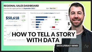
- Our Sweet Slides 101 webinar series focuses on crucial presentation and visual communication skills. This time we offered a data visualization webinar, From Numbers to Narrative.
In this webinar, we discuss how to take large amounts of data in our presentations and turn them into graphs and charts that effectively showcase the important data points. Learn how SlideRabbit uses data visualization techniques in our slide designs to express data storytelling.
Key Information Discussed:
● Data-savvy professionals enjoy more success
● Data storytelling and using data analysis to create a story to understand the data
● When to think about creating TRACTion with your data (Titles, Recommendations, Annotations, Conclusions, and Takeaways)
▶ Data-savvy professionals enjoy more success
In our data-driven world, decision-making processes hinge upon the insights gleaned from data analysis. From optimizing operations to driving strategic initiatives, data underpins nearly every aspect of business today.
It’s not enough to simply possess data - it’s how we interpret and communicate that data in our presentations that has a profound effect on how we perform in our professional lives.
By honing data skills, from analyzation through communication, professionals can strengthen their careers and expand their opportunities. Effective data visualization and analysis can make or break your presentations and can be the difference of whether or not you get buy-in from your audience.
▶ How do you make a story out of data?
When faced with a set of data, the challenge is to understand that data and be able to communicate important insights through your presentations with context so that the recipients of the information take appropriate action.
To get from raw data to a true story, there are four major steps:
1. Review data for understanding
2. Identify simple insights
3. Choose the right graph
4. Provide context and action items
▶ When it comes to data, think about creating TRACTion
To make sure that your data visualization in your presentations is working hard, check to see if have included the following:
T = Titles that provide guidance on what the data is telling us
R = Recommendations on what changes or decisions should be made according to the data
A = Annotations that draw attention to the right things, or explain outliers
C = Conclusions drawn from your evaluation of the data
T = Takeaways about next steps and action items
Thanks for watching our data visualization webinar, From Numbers to Narrative!
⏯ Check out our next presentation skills webinar, Captivate & Engage: us06web.zoom.u...
-----------------------------
Whether you need Google Slides or PowerPoint presentation designs, SlideRabbit has the expert designers to enhance your slideshows. Schedule a free consultation to discuss all our presentation design services: sliderabbit.com/.


😎