What is the difference between RGB and CMYK?

Вставка
- Опубліковано 17 тра 2016
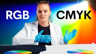
- When it comes to design it's important to know the difference between your standard colour models, RGB and CMYK, and which to use.
Visit us at www.expresscards.com.au for more information - Навчання та стиль


Awesome video! Now I know why my portfolio came out slightly different coloured from what I saw on Photoshop. Thanks!
Wow, the best video explaining the difference between additive and subtractive color models. The animation with the printer on the white paper was spot on!
1:39 my mans is having a heated online argument with someone
Defo a liberal
Defo someone who makes everything political
Thanks for the 2 minute refresher course.
In the Flexo print industry CMYK is standard use. I have over 20 years experience in the Flexo industry
Great video man.
Cmyk are colors use in the printing system. RGB are use for the screens in 📺
Perfect Illustration
Clear explanation, thanks
Great video thanks
Good video bro!
I learned about RGB because I have led lights that have a feture where you can mix your own colors using different amounts of green blue or red light
very nice video
additive is for light, substractive is for pigment. one thing I don't understand, why is it not just CMY? according to the substractive synthesis wikipedia page those 3 pigment combined make black.
Yeah but combining those in real life makes some kind of muddy grey.
The mixture isn't perfect, also it would take longer to dry, or may,damage thinner paper.
Also: when you're printing stuff there will be lots of black ink for copy (eg, text). It's easier and cheaper to have the black ink separate then having to use all three pigments every time.
Quick question so when ordering cartridges from a supplier he does not give you option to do colored or black .. is there a reason why they only sell singular colors ?
Most likely to make money. It'd be cheaper for you to just order black, but more of a profit for them if you bought colours that would give you black (which needs to be 2 plus colours, obviously).
Subhan Allah that’s amazing
Enlightenment
Could mirror is future display for broadcasting streaming in data less
Black color symbol K why.
It will be B.
Please explain
Thanks mate. Very quick and informative this is why my prints suck
nice
why do we need to work in cmyk when its for print? im in the print busi ess for 10 yrs and setting up my file in cmyk makes the colors printed in weird /false colora and shades. the printer does have cmyk ink cartridges but i can not achive any nice colors if my file is crated and saved in cmyk. if i create an rgb color the colors pop a lot more.
maybe because the screen runs in RGB ?
SOO COOL
i love you!
I heard CMYK is about pigment and RGB is about light so why red+blue in RGB makes purple while we know that mixing red and blue pigment makes purple? I'm new to color so if I'm saying it wrong let me know.
Mixing red and blue makes a brownish purple. Mixing cyan and magenta makes a perfect purple.
Because cyan magenta and yellow makes black and because red and blue are a mix of all 3 main colors cyan magenta and yellow, it always have a bit of black in it.
Try to mix cyan with rgb, then you see the reason for this. You can't mix it because you had to reduce color pigments instead of adding.
Cmy is for adding color, rgb is for reducing color.
i like video
THANK U omg
1:39 this man ruined everything with his distractive moves))
CMYK are printing colours, while RGB are light colours.
I like the guy who's stabing on paper😍😍
y not white?
y not cmyw?
This is because most prints are on a white stock, however some printing does use a white ink and different colored stocks
Ahhh this maybe why when I buy a pair of shoes online the screen shows one color, but when I actually get the shoe its a whole different color. One pair I had to take back because I didn't like the color. Haha
This is future of life communication all specie materials creation and heat control and human health in lcd or led
RGB and CMYK created eachother lol
How does red and green make yellow?! I’m so baffled by this. If I mix red and green paints together they will come out brown.
A year late, but other people might have the same question...
Light is a stream of photons. As those photons collide with a surface, they reflect back and travel to your eyes. When a surface has a specific pigment, the photons matching that energy level (frequency) are absorbed and do not return to your eyes. So we start with white light, then we add a pigment, and now that frequency of photon is absorbed. So that frequency is subtracted from the white light. We decide the resulting color is "red." So red is just white minus , which we've collected into our red paint. Then we add the stuff that absorbs another set of frequencies; we decide this second stuff creates what we call green. When you have all the frequencies removed from white that create red, and all the frequencies removed that create green, you are left with only the frequencies that create brown, because you removed frequencies that went into making red and green individually if they didn't overlap. This is subtractive color space.
It's hard to describe here without a lot of double negatives, because you are removing frequencies, so the lack of them is what creates the color your eye interprets. The main point is that paint we associated with any given color, is just a substance that absorbs all light other than that color. So any color relying on something it absorbs, is no longer possible, regardless of the other paints you might add. You can only get closer and closer to black (all frequencies being absorbed).
With a computer, you are adding all the frequencies required to create red and adding all the frequencies required to create green. So you have more "other" frequencies bouncing off the glass on your monitor into your eyes. This is additive color space.
Let's say Red Paint is absorbing A + B frequencies. And Green Paint is absorbing B + C frequencies. Then you are absorbing A, B, and C when you add them together. And imagine white light is the full alphabet, so you are now seeing light that is every other letter combined minus those three; you are seeing 23 out of 26 letters. But the computer screen is emitting C when it makes red light. And it's emitting A when it makes Green light. So only B isn't reaching your eyes when the computer adds Red and Green, so you have 25 out of 26 letters. These are definitely different colors, even though you started with the same perceived colors.
Mason DeRoss Honestly, I appreciate you taking what I can only imagine was a great amount of time to write that. It still confuses me like crazy though.
You're confusing pigments of ink with the energy of light. Think of it this way:
Light is made of energy in the form of waves. Shorter waves make you see blue while longer make you see red. Green is in the middle. A rainbow contains all the visible wave lengths from blue to red. The more waves you put on top of each other, the more energy you have resulting in a brighter light. It's the same with fire. The more energy a fire has, the brighter it burns. This is why a green light and a red light combined make a yellow light. Yes, yellow is lighter than green or red, but the two combined have more energy than when they are alone. As i said, more energy becomes a brighter light. All waves of light combined have the highest energy, resulting in a white light.
Inks on the other hand are basically light filters. When you see a red dot printed on paper, the ink is not actually red but absorbes the blue and green wave legths. Only the red waves are left and bounce back into your eye. When you print more inks on top of each other, more wave legths of light are absorbed until no light is left to bounce back into your eyes and the dot becomes black.
When you mix red and green ink, the red ink absorbes blue and green light waves and the green ink absorbes the red and blue ones resulting in a dark color because not much light waves are left (this process is not perfect though. A little bit of light will always bounce back into your eye, thats why its brown and not black and black is an extra color. The pigments in black ink are made to absorb as much light as possible)
This is a very basic explanation but in the end, this is basically how it works.
okay
Cyan is just blue?
No.
@@Fb_Sim_Cyan_Friend yes it is just light blue lol
So RGB is strictly for web and device design and CMYK is for print?
That's correct! If it's on a screen use RGB if uses ink use either CMYK or Spot Colours (depending on how you're printing them)
Oh thank goodness. I've been trying to figure out when to use which when doing a design on photoshop. Thanks. :)
Not exactly. RGB is a colour space for light emitting media (chiefly computer screens and TV), while CMYK is a colour space for light absorbing media (chiefly the print industry).
Note that I say *a* colour space in both cases. An infinite number of colour spaces are possible for both media types. RGB and CMYK are just the most common.
It should be noted that artists tend to have a Red Yellow Blue (plus Black or dark grey) mindset and would struggle with CMYK.
Ahhh. Additive and subtractive . I remember now. When printing with ink u need CMYK. Dot matrix
PUO pattern CMYK !!! :) www.PUO.zone
JP Morgan Chase was ❌x❌ like Kilroy..
LOL IT DOES REALLY LOOKS LIKE KYO HAHAHAHHA
K stands for KEY not blacK !!!!!
He mentioned this were u not paying attension
mahh
.. get an efi fiery and dont care. Its just that simple.
Awesome video! Now I know why my portfolio came out slightly different coloured from what I saw on Photoshop. Thanks!