Here's a really great and in-depth article by Miriam Suzanne about the issues that can happen if you define a container on the html element: www.oddbird.net/2023/07/05/contain-root/
Wow Kevin. How did you know I was just thinking this past weekend that I need to adopt container queries in 2024. You got a crystal ball on your desk. 😀
Long ago when Media queries were new, I asked in Miriam's SASS MeetUp group how to figure out the breakpoints. Someone (likely an OddBird partner) said "Just resize the section to see where the point should be".
@@thorstenl.4928 Being knowledgeable and being able to teach are not synonymous, nor symmetrical terms. One can put in the effort needed to become skillful at something, yet lack the ability to clearly articulate the subject in a manner that clearly illustrates core concepts in a digestible fashion. So, to answer your question; no. Unless of course, someone in an emotionally unhealthy human being who perceives everything as an attack.
@@scottonanski4173 No I'm sure you ment this as a compliment from your heart. However I think you oversee two things. 1. Teaching is a skill you can learn. The more you practice and the more you prepare, the better the lessons. I don't believe thats a gift you got or not… 2. Even though these are two different skills, they are connected in a very strong way. The more you teach, the better you get in what you teach. It's in fact one of the best techniques to learn. And the better you are in a subject, the better your teaching will become. You will be confident and less nerveous, what makes you calm and gives you a competent appearence. That helps enoumously to keeping structure in the lesson. I'm sorry if you felt insulted or so. That was not my intention. I just think the teching is at least the same amount of work, as the skills itself.
I know across the web you see "mobile first" but for me it has always seemed easier to do desktop first. It always seems easier to take away things as things get smaller rather than add things as things get bigger... so for this reason I've always been a fan of "max-width" instead of "min-width".
@@theman7050 Amateur : "a person who engages in a particular activity as a hobby rather than as a professional". Labeling a preference for max-width over min-width as "amateur" seems to overlook the depth of strategy involved in web dev. In my over 20 years working as a professional, I assure you, sometimes the choice is less about following a crowd and more about what works best for the project at hand. YES, sometimes it works and in other instances it makes it more difficult. Interestingly, resorting to insults often reflects a more amateur stance.
This may be an acceptable strategy in some cases. In my experience, rarely will things be added or removed based on screen size. It will be more of a reshuffle/resizing of elements (they are already in the DOM). The main benefit of mobile first is that it forces you to think usability and design a layout that can work on smaller screens. Not going mobile first literally means mobiles are of secondary importance to you. Its usually easier to scale up (where you now have more space and flexbility) rather than down (where you will now be forced to squeeze everything into a much much narrower view). Experienced people could work either way but mobile first makes sense in a world where mobiles have some importance.
Same. I've faced this issue while solving challenges from Frontend Mentor. I always switch between my workflows. Afterall it's up to me to choose what's comfortable to me instead of choosing a recommended workflow
Thanks for all the work you do to keep us up to date on the latest in CSS. Been watching for years and have taken several of your courses - and I never fail to learn something. And teaching me anything is not a simple task. 😀
great timing on the video, i just finished a design template using container queries and want to use them more, i think they are much more useful for responsive designing elements, i like your idea of making a container, i will play with that, always learning something new, thanks Kevin
I can’t live without clamp(). I’ve gotten so obsessed with coding responsively that I feel like a failure if I have to use a media query for most things . Sometimes layout stuff where flex wrap or grid auto fit doesn’t work and can’t be helped but love that with grid template areas I can just redeclare the areas and i don’t have to unset grid children columns and rows. And padding and margins in EMs with clamp is just so perfect. CSS forever! And now popover is supported ! Was just playing with it 2 weeks ago and Firefox held me back but poof! Now it’s green!!
That was a really great overview! The only problem with your videos is that, every time I watch one, I want to go back and redesign my entire website. At this rate, I'll *never* get it finished!
Thanks a lot man. Few minutes ago I was struggling to use media queries and it's like that you felt my pain of media queries anyway this will helpful to me.😂😂
Thank you, very much, Kevin! I enjoyed the first part about media, although I already knew about this topic (sometimes little things come to light). The second part about container is brilliant!
It's definitely magical. I love it, and love only learning CSS NOW rather than 5-10-20 years ago. (I did try 10 years ago but just didn't click). Id be interested if you do a video on the different available container types regarding sizing. Aside: continer style queries ;) Hoping my daughter will come back with a tinge of your accent. She's just gone to St John's area in Newfoundland for 5 months of school (she's 17, specifically Conception Bay South)
20 years ago, you could earn money on knowing the best hacks to make browsers behave the same way. Today, you most probably have to have more in depth knowledge on other parts of design like UX, security, SEO and performance too, aside from just web design. The knowledge no longer needed from back then has to be filled with something else today, so it's not like it has changed that much in a way. As browsers get more things to be used for, the designer also has to learn more.
I have had a use-case where I used min(2cqw,2cqh) for font-size. This was used in a page that would scale nicely with the available space. It would automagically switch from portrait to landscape, with an appropriate font size. (Ok, Clamp was also used to keep things from becoming unreadable.) It might be fun to see master Kevins take on doing something like this.
I've watched and listened to many videos, tho admittingly at a high speed... I think this is the first time I've understood front end friend. Previously I heard franken friends and I never understood it but didn't care enough to question it since it was just used in the intro / outro.
My approach is to try the least amount of media queries or container queries. Same counts for grids, I use variable grids, with with with a min-width which can be never narrow at any circumstances, but breaks seamlessly in the next row. Very similar to the flex wrap behaviour, where the content just goes to the next line, if the width gets too small. I know there are cases, where we need or want to use media queries, but then I always start to make a comparison for each breakpoint where it gets more complexity. Some are at mobile, some will be at desktop view. This also helps to figure out, which direction of media query you will need. Be it min-width or max-width. Fonts and spacings I make use of clamp and calc features, so everything stays fluid in all more or less modern browsers. Hopefully, this piece of information is helpful to those are new into the niche - dealing with dirty code inside hell.
Great content. I've been following you for a long time and appreciate all the insights you provide. I have a question regarding media queries, even though I'm not primarily a front-end dev and only touch base with it from time to time. In my last project, I had to maintain a 1:1 and a 1:3 aspect ratio for several canvas grid items/components (7] on the same page. A dashboard. I tried using techniques similar to your approach with breakpoints for grid items and font sizes with components , but the flex inside the grid stretched the canvases to different sizes on devices like iPad Pro, iPad Mini, and phones. I used my breakpoints, but ended up calculating container sizes and grid items using JS constants based on the canvas aspect ratios and the total screen size (height and width). This made the code quite unreadable for anyone coming after me. It would be really interesting to see how you manage/ would solve this to maintain different aspect ratios on various canvas components on the same page using media queries. Any tips or examples would be greatly appreciated! Thanks!
As someone who has only recently gone from game development to web development, I'm kind of fascinating by how much of web remains "unsolved". CSS has been particularly interesting.
Great video, once again Kevin. Just curious if container naming sounds a bit like adding a 'container' class to the container, and using that to select it instead? isn't this redundant? Cheers!
hello Kevin, thank you again for this excellent video. I was looking and indeed I would be interested in a video explaining what more we can do with @media...but then I also wanted to know what all the existing properties are using an @ (@media, @container, @keyframes..etc), I don't know if that would be a relevant video topic. THANKS
In my experience, setting container-type: inline-size on a page-wide element didn't work well because it creates a new stacking context for that element resulting in issues with z-index etc (and some other, which I don't recall off the top of my head). The motivation was to just then replace all @media rules with @container rules. But it just didn't work out smoothly. Ended up using containers locally, which is where they are at their best.
Media queries will ultimately be used how they were originally intended... To style your content relative to your media. For example you can use a media query to know if there is a pointer device. But you can't do that with a container query. If there is a pointer you can do hover effects. If there is no pointer you will need to do something else to draw the users attention to something.
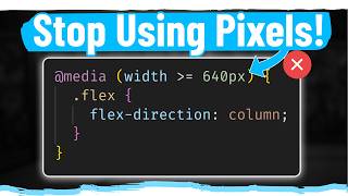
I've been a developer for over 15 years, but personally, I actually think the `600px < width < 800px` syntax is awful and confusing at first glance. I think I'd rather type `(min-width: 600px) and (max-width: 800px)`. Straight off the bat, I know what I'm getting.
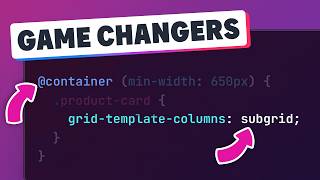
By the use of the primary-content class to give it the container-type of inline-size I assume that that container definition can be made on a wrapper (like the .cards) or in the item you want to style itself (in this case primary-content). So instead of giving it to .cards you could have given the property to .card, right?
container style is really interesting, i wonder if it can be an alternative to scss mixins only thing missing is :container selector to select container itself body { --foo: bar; } @container style(--foo: bar) { * { background-color: blue; } }
So is the main benefit of container queries to give individual effects to elements and not to all of them at the same time? I dont fully see the difference tbh
At roughly 25:30 What would happen in a broswer that does not support cqi, cqb, etc...? and if not using something like postFix what is the fallback that needs to be wrtten above?
Declaring a container on the body or root has some annoying side effects. As I understand it, it has mostly to do with how propagation works differently for overflow and containment. The former propagates to the viewport, while the latter remains on the root. It will cause problems for scrolling in the contained axis, elements with `position: fixed`, the root stacking context etc… It’s possible to get around this by declaring `block-size: 100%` on the html AND body element, along with `overflow: auto` on the body. It aligns overflow with containment, but the scrollbar will now be on the root element instead of the actual viewport. It feels a bit dirty, but it works.
Why are you not using the container query on the .card ? Ie if you are using grid with repeat() minmax this would work better on the .card vs .cards as the grid columns are defining the .card width
I can see why as the parent item does not allow styles to be applied. need to place a wrapper and apply the styles. In my test i have a .card (say full width) then below them have the same cards in a grid container containing 3 rows of .card ... Now i have several styles applied to .card in previous css but then attempting to override that css using even !important has no effect. Only way is to move the styling to e.g .card-inner-wrapper which is inside the .card I guess i figured that we would be using @container on the .card and not the .cards (ie using flexbox/grid on .cards to create a 2/3 1/3 you can't apply styling on your .card in one hit. It can be done provided you use a .card-inner-container ... strange...
with container queries i find it hard to select container itself in shadowDom i can do :host, in @scope i can do :scope idk if there is something similar in @container.
If i had to learn css again, or teach it... I'd start with cascading layers, custom variables, resets and queries (container and media). Then I'd start on styles.
Using container size in font-size may have its use case but in general it's not a good practice as it will lead to many different font sizes and inconsistency is bad design.


Here's a really great and in-depth article by Miriam Suzanne about the issues that can happen if you define a container on the html element: www.oddbird.net/2023/07/05/contain-root/
Wow Kevin. How did you know I was just thinking this past weekend that I need to adopt container queries in 2024. You got a crystal ball on your desk. 😀
Long ago when Media queries were new, I asked in Miriam's SASS MeetUp group how to figure out the breakpoints. Someone (likely an OddBird partner) said "Just resize the section to see where the point should be".
😊@@tombyrer1808
I told him
Such a naturally gifted teacher. Assumes no preunderstanding, and breaks it down in practical ways that are easy to digest.
Isn't „naturally gifted“ a term that downplays all the work and efford, that Kevin invested to get to this point?
@@thorstenl.4928 Being knowledgeable and being able to teach are not synonymous, nor symmetrical terms. One can put in the effort needed to become skillful at something, yet lack the ability to clearly articulate the subject in a manner that clearly illustrates core concepts in a digestible fashion.
So, to answer your question; no. Unless of course, someone in an emotionally unhealthy human being who perceives everything as an attack.
@@scottonanski4173
No I'm sure you ment this as a compliment from your heart.
However I think you oversee two things.
1. Teaching is a skill you can learn. The more you practice and the more you prepare, the better the lessons. I don't believe thats a gift you got or not…
2. Even though these are two different skills, they are connected in a very strong way.
The more you teach, the better you get in what you teach. It's in fact one of the best techniques to learn. And the better you are in a subject, the better your teaching will become. You will be confident and less nerveous, what makes you calm and gives you a competent appearence. That helps enoumously to keeping structure in the lesson.
I'm sorry if you felt insulted or so. That was not my intention.
I just think the teching is at least the same amount of work, as the skills itself.
I'm a backend developer, but I always enjoy watching your videos
I know across the web you see "mobile first" but for me it has always seemed easier to do desktop first. It always seems easier to take away things as things get smaller rather than add things as things get bigger... so for this reason I've always been a fan of "max-width" instead of "min-width".
Other amateurs also feel the same
@@theman7050 Amateur : "a person who engages in a particular activity as a hobby rather than as a professional".
Labeling a preference for max-width over min-width as "amateur" seems to overlook the depth of strategy involved in web dev. In my over 20 years working as a professional, I assure you, sometimes the choice is less about following a crowd and more about what works best for the project at hand. YES, sometimes it works and in other instances it makes it more difficult. Interestingly, resorting to insults often reflects a more amateur stance.
This may be an acceptable strategy in some cases. In my experience, rarely will things be added or removed based on screen size. It will be more of a reshuffle/resizing of elements (they are already in the DOM). The main benefit of mobile first is that it forces you to think usability and design a layout that can work on smaller screens. Not going mobile first literally means mobiles are of secondary importance to you. Its usually easier to scale up (where you now have more space and flexbility) rather than down (where you will now be forced to squeeze everything into a much much narrower view). Experienced people could work either way but mobile first makes sense in a world where mobiles have some importance.
Same here! I always have followed this train of thought!
Same. I've faced this issue while solving challenges from Frontend Mentor. I always switch between my workflows.
Afterall it's up to me to choose what's comfortable to me instead of choosing a recommended workflow
Thanks for all the work you do to keep us up to date on the latest in CSS. Been watching for years and have taken several of your courses - and I never fail to learn something. And teaching me anything is not a simple task. 😀
You are an awesome teacher. Tried to learn the same stuff from other channels , but here got more than that.
great timing on the video, i just finished a design template using container queries and want to use them more, i think they are much more useful for responsive designing elements, i like your idea of making a container, i will play with that, always learning something new, thanks Kevin
One of the greatest videos! It helped me a lot to grasp container queries comprehensively. Thank you
Perfect timing
My friend was asking me to recommend a video like this
Thank you
Whenever I have a question about something in CSS, you always end up making a video about it sooner or later 🥰
I can’t live without clamp(). I’ve gotten so obsessed with coding responsively that I feel like a failure if I have to use a media query for most things . Sometimes layout stuff where flex wrap or grid auto fit doesn’t work and can’t be helped but love that with grid template areas I can just redeclare the areas and i don’t have to unset grid children columns and rows. And padding and margins in EMs with clamp is just so perfect. CSS forever! And now popover is supported ! Was just playing with it 2 weeks ago and Firefox held me back but poof! Now it’s green!!
If a media query does the job then use it.
@@MorganFeeneyI know I need to unlearn that narrative that @media means your responsive layout is a failure
That was a really great overview! The only problem with your videos is that, every time I watch one, I want to go back and redesign my entire website. At this rate, I'll *never* get it finished!
Thanks a lot man. Few minutes ago I was struggling to use media queries and it's like that you felt my pain of media queries anyway this will helpful to me.😂😂
Thank you, very much, Kevin! I enjoyed the first part about media, although I already knew about this topic (sometimes little things come to light). The second part about container is brilliant!
this is the first time I heard about container queries. Thanks Kevin!
It's definitely magical. I love it, and love only learning CSS NOW rather than 5-10-20 years ago. (I did try 10 years ago but just didn't click). Id be interested if you do a video on the different available container types regarding sizing. Aside: continer style queries ;)
Hoping my daughter will come back with a tinge of your accent. She's just gone to St John's area in Newfoundland for 5 months of school (she's 17, specifically Conception Bay South)
20 years ago, you could earn money on knowing the best hacks to make browsers behave the same way.
Today, you most probably have to have more in depth knowledge on other parts of design like UX, security, SEO and performance too, aside from just web design. The knowledge no longer needed from back then has to be filled with something else today, so it's not like it has changed that much in a way. As browsers get more things to be used for, the designer also has to learn more.
❤ Thanks sir a lot I am struggling using media Quiere and now you solve my solution Thanks a lot.
I always need a review on container queries, I seem to have a brain block. Thanks!
I have had a use-case where I used min(2cqw,2cqh) for font-size. This was used in a page that would scale nicely with the available space. It would automagically switch from portrait to landscape, with an appropriate font size. (Ok, Clamp was also used to keep things from becoming unreadable.)
It might be fun to see master Kevins take on doing something like this.
Glad youtube recommended this video to me. Very informative discussion. Thanks!
i just want to say thank you for all your videos and your good vibes ;)
I've watched and listened to many videos, tho admittingly at a high speed... I think this is the first time I've understood front end friend. Previously I heard franken friends and I never understood it but didn't care enough to question it since it was just used in the intro / outro.
My approach is to try the least amount of media queries or container queries. Same counts for grids, I use variable grids, with with with a min-width which can be never narrow at any circumstances, but breaks seamlessly in the next row. Very similar to the flex wrap behaviour, where the content just goes to the next line, if the width gets too small.
I know there are cases, where we need or want to use media queries, but then I always start to make a comparison for each breakpoint where it gets more complexity. Some are at mobile, some will be at desktop view. This also helps to figure out, which direction of media query you will need. Be it min-width or max-width.
Fonts and spacings I make use of clamp and calc features, so everything stays fluid in all more or less modern browsers.
Hopefully, this piece of information is helpful to those are new into the niche - dealing with dirty code inside hell.
Great content. I've been following you for a long time and appreciate all the insights you provide. I have a question regarding media queries, even though I'm not primarily a front-end dev and only touch base with it from time to time.
In my last project, I had to maintain a 1:1 and a 1:3 aspect ratio for several canvas grid items/components (7] on the same page. A dashboard. I tried using techniques similar to your approach with breakpoints for grid items and font sizes with components , but the flex inside the grid stretched the canvases to different sizes on devices like iPad Pro, iPad Mini, and phones. I used my breakpoints, but ended up calculating container sizes and grid items using JS constants based on the canvas aspect ratios and the total screen size (height and width). This made the code quite unreadable for anyone coming after me.
It would be really interesting to see how you manage/ would solve this to maintain different aspect ratios on various canvas components on the same page using media queries. Any tips or examples would be greatly appreciated! Thanks!
Finally, I have been waiting for this
That was a bada55 color, Kevin... very subtle 😂
Awesome explanation
Very helpful Kevin. Thank you
As someone who has only recently gone from game development to web development, I'm kind of fascinating by how much of web remains "unsolved". CSS has been particularly interesting.
Great video, once again Kevin. Just curious if container naming sounds a bit like adding a 'container' class to the container, and using that to select it instead? isn't this redundant? Cheers!
Thank you, sir!
hello Kevin, thank you again for this excellent video. I was looking and indeed I would be interested in a video explaining what more we can do with @media...but then I also wanted to know what all the existing properties are using an @ (@media, @container, @keyframes..etc), I don't know if that would be a relevant video topic. THANKS
In my experience, setting container-type: inline-size on a page-wide element didn't work well because it creates a new stacking context for that element resulting in issues with z-index etc (and some other, which I don't recall off the top of my head). The motivation was to just then replace all @media rules with @container rules. But it just didn't work out smoothly. Ended up using containers locally, which is where they are at their best.
Media queries will ultimately be used how they were originally intended... To style your content relative to your media. For example you can use a media query to know if there is a pointer device. But you can't do that with a container query. If there is a pointer you can do hover effects. If there is no pointer you will need to do something else to draw the users attention to something.
You need 'In Grid We Trust' on that grid t-shirt mech ;) Great vid, hugely helpful as awlays/
I would like to see all the things media queries can do in a complete video. Thanks.
You're a really good teacher.
6:07 ...that colour is badass
Thank you, you beautiful angel of a man
Not sure if it's just me, but I find the readability to be much better if you put the 'width' string first in a media query. Ie. (width > 800px)
I've been a developer for over 15 years, but personally, I actually think the `600px < width < 800px` syntax is awful and confusing at first glance. I think I'd rather type `(min-width: 600px) and (max-width: 800px)`. Straight off the bat, I know what I'm getting.
By the use of the primary-content class to give it the container-type of inline-size I assume that that container definition can be made on a wrapper (like the .cards) or in the item you want to style itself (in this case primary-content). So instead of giving it to .cards you could have given the property to .card, right?
Which is better semantics and for screen readers? article inside section or section inside article?
Came here hoping to leverage @container as a work-around for CSS' lack of an Elvis (ternary) operator. We need conditional styling!
how did make image responsive i am struggling with them they are having different sizes. can u make video on them
What's the use of container-type: size if you need to define the container's height explicitly? Doesn't that defeat its purpose?
great content
container style is really interesting, i wonder if it can be an alternative to scss mixins
only thing missing is :container selector to select container itself
body {
--foo: bar;
}
@container style(--foo: bar) {
* {
background-color: blue;
}
}
why change the variables in media queries for fonts sizes, it is the same work done twice.
So is the main benefit of container queries to give individual effects to elements and not to all of them at the same time? I dont fully see the difference tbh
That screen thing wasn't properly explained. What does it do? What difference would be noticed in the print with and without screen?
Super❤
It reminds me, in CSS Houdini we'll may have the custom media range with @custom-media
Aside ... love the new shirts (esp colour) but I need to buy an old sticker. When are you retiring the other store?
At roughly 25:30 What would happen in a broswer that does not support cqi, cqb, etc...? and if not using something like postFix what is the fallback that needs to be wrtten above?
Container/style queries for component/intrinsic level design!
You know what would be cool? Make the shirt"s illustrations in css to promote it
Una's article URL on style queries?
does he have any tutorials on creating a fluid grid?
Declaring a container on the body or root has some annoying side effects. As I understand it, it has mostly to do with how propagation works differently for overflow and containment. The former propagates to the viewport, while the latter remains on the root. It will cause problems for scrolling in the contained axis, elements with `position: fixed`, the root stacking context etc… It’s possible to get around this by declaring `block-size: 100%` on the html AND body element, along with `overflow: auto` on the body. It aligns overflow with containment, but the scrollbar will now be on the root element instead of the actual viewport. It feels a bit dirty, but it works.
Why are you not using the container query on the .card ?
Ie if you are using grid with repeat() minmax this would work better on the .card vs .cards as the grid columns are defining the .card width
I can see why as the parent item does not allow styles to be applied. need to place a wrapper and apply the styles.
In my test i have a .card (say full width) then below them have the same cards in a grid container containing 3 rows of .card ... Now i have several styles applied to .card in previous css but then attempting to override that css using even !important has no effect. Only way is to move the styling to e.g .card-inner-wrapper which is inside the .card
I guess i figured that we would be using @container on the .card and not the .cards (ie using flexbox/grid on .cards to create a 2/3 1/3 you can't apply styling on your .card in one hit. It can be done provided you use a .card-inner-container ... strange...
I'm not sure but I thought that min-width: 600px will trigger on screen 601px and above (not including 600px)
with container queries i find it hard to select container itself
in shadowDom i can do :host, in @scope i can do :scope
idk if there is something similar in @container.
If i had to learn css again, or teach it... I'd start with cascading layers, custom variables, resets and queries (container and media). Then I'd start on styles.
Why do we need media queriess at all when the wrapper could have a container query itself?
Container query on the body?
Using container size in font-size may have its use case but in general it's not a good practice as it will lead to many different font sizes and inconsistency is bad design.
All the great shirts you mention no longer seem to be available 😞 The new ones are really not my jam at all...
Liking before even watching it 💪
Seems like you can dynamically name containers with the :has() selector too.
```
*:has(> .card) { container-name: card-wrapper; }
```
i was weirded out when i tried to use position fixed inside a container
deep dive please
could you do a video explaining how the UA-cam subscribe button rainbow works?
🎉
#bada55 = badass css mentor
I feel like it should be called component query instead of container query
The genius at CodePen who decided that the character sequence "
CSS Media Queries
ua-cam.com/video/iOA8q-DmxhM/v-deo.htmlfeature=shared
why you think that we all seniors in the web when you explain ?? it so complicated
Nah dude it just means that it's too hard of a topic for you for now, if you now the basics then it's all understandable
CSS Sensei 🫡
CSS Media Queries
ua-cam.com/video/iOA8q-DmxhM/v-deo.htmlfeature=shared