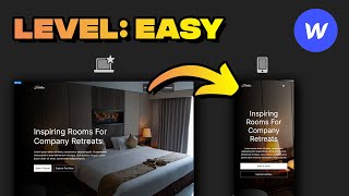
Master Responsive Layouts Using Figma and Webflow

Вставка
- Опубліковано 28 тра 2024
- In this tutorial, we'll walk you through the process of turning your Figma designs into responsive Webflow layouts. Learn practical tips and techniques that will help you create adaptable websites with ease. If you're looking to improve your web design skills, this video is for you.
Take a look at REMS vs Pixels, vs VW
• How To Build A Respons...
💻 Explore Figma Components 👇
www.tilebit.io
🛠 Try Figma 👇
bit.ly/3LqgGig
🛠 Figma For Pros 👇
bit.ly/3V5oZmD
0:00 Figma Designs
2:15 Layout Divs
4:30 Scaling To Mobile
6:20 Making It Responsive
🚀 Subscribe for more weekly design content
bit.ly/2FQLrO5
🎥 What I use in my videos!
kit.co/arnauros/filming-setup
📄 Bonsai Referral (try for free)
www.hellobonsai.com/invite?fp...
👨💻 Connect with me
arnau.design
🌎 Socials
/ arnau_design
/ arnau_design
DISCLAIMER: Links included in this description might be affiliate links. If you purchase a product or service with the links that I provide I may receive a small commission. There is no additional charge to you!


No more using Pixels! I recommend taking a look at my REMS video if you haven't already mastered responsive units. (Link under description)
Figma to Webflow goes HARD 🔥🔥
Yeah man, the webflow plugin works wonders. Do you use it a lot?
The best beginner WEBFLOW CMS tutorial I watched so far. Subscribed.
Awesome, thank you!
Thank you, great tutorials, simple, direct and very good points and tips.
Thank you Felipe!
Great tutorial Arnau! Would be great to see more client-first website building like this
Coming soon!
Looks clean as heck! Great tutorial Arnau 👏🏼
Thanks Adrian, been following your IG! DM me we should collab in some way 🚀
@@ArnauRos Sounds like a plan! I'll message ya after the holidays 🐣 Have an awesome weekend Arnau!😁
@UIadrian Hey! Followed you on Twitter speak soon 😄
How did you make the image to be on top of the content? Webflow keeps putting the right side to be on the bottom
Bro keep up the great content, the value you're providing aspiring web flow devs is unreal! I personally would really like to see you expand on this and get slightly more advanced! As someone who's competent in web flow but is trying to make the leap to rems and has dabbled in a bit of client first, I think it would be sick if you could use the client first px to rem tool and reverse engineer a px design to show the differences between the two! I feel like this would be more digestible for myself but even more so for new devs flirting with the idea of REMS. That's my 2 cents anyway lad, love from the UK keep it up 🔥
Thanks for the comment, more to come!!
The video I was looking for! I didn't understand how to make sure that the content doesn't stretch beyond a certain screen width but does adjust when it gets narrower. All I see on YT is videos with auto layout and fill OR the constraints, but not the combination of it. So if Im correct you design a frame that is larger than the 1440 in Figma with the content still centered and control the behavior of the website in the websitetool like Webflow or Framer by installing a max width? I'm very new to this so not sure if Im describing it correctly. Thanks in advance.
Yes exactly, after a breakpoint you just use max width to keep everything in place :)
Great video, would be good to see a tutorial for scaling down text from desktop to 320px in mobile using client first fluid responsive
Sure! We can definitely do that :)
Do you have to manually change the heading and text sizes for different breakpoints? And do you do that for "All H3 headings" or do you create a class for that heading? Thank you for the walkthrough
yep! all h3 headings (global)
do you have content on how you design in figma with webflow development in mind? love the content!
Yes defintely! Take a look at the channel and look up webflow
Great video! Why you developed it manually when you can use the Figma to webflow plugin? Is there any downsides of using the plugin instead of manually developing ?
theres still some issues with the plugin its not perfect
New to Webflow here! I noticed that you use a div block solely for padding and margins. Is there a reason to do it like this rather than setting the padding on the parent div or using flex box?
You can also use flex box, theres so many ways of doing it :)
so for your spacing you don't use flexbox, you use div blocks set to rem? can all of this be done without grids? i ask bc i started using a figma plugin that lets you copy and paste from figma to webflow - it's actually amazing. you need to make some tweaks after you paste in webflow, but it does a lot of the heavy lifting. anyways, it doesn't use grids, it uses flexbox by default.
Flexbox and grid are essentially the same element, you can use the flexbox 100%
@@ArnauRos thanks! If you set the max width as 100 REM how is that different than setting it as 1600px? Either way your max width is that static number.
I just came from your REM video btw - i love your content. It's been very helpful, filling in the gaps of knowledge.
Also, you have an ideal image for this demo. The background can shrink / grow it's height and width. but how would you address a backgroundless image on mobile. It looks awkward when i stack it.
Did you change the 5rem padding to 2.5rem in mobile?
Hey, in Mobile its 1.5rem. Its inheriting the size from Tablet which is set to 1.5rem.
The only problem with this bro, is that in Webflow, 1440 is desktop large. On Webflow 1024 is considered desktop... then you have 1270 or something, 1440 and 1920 (1080P)... so if you design in Figma for 1440 seeing that as the base desktop it's going to be huge in Webflow's base desktop and not fit.
you need to use %'s, vw's, REMs when building in WF to help it scale correctly
is there a template for the figma file you used?
Not yet, coming soon :)
@@ArnauRos Great thank you, when aproximately?
Website auto layout responsive?
you can make responsive sites with autolayout
My image auto layout problem was laughing watching your video gave me peace
Please go advance
Not sure what you mean here :)
@@ArnauRos lol you asked if we want you to go into advanced details about the video and how to use rems and all , so I said please go advance
@@themichaellll Got it! Sounds good thanks for the idea